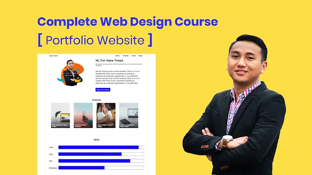
In this complete tutorial, you will learn to create a simple, functional and responsive Portfolio Website using HTML and CSS only.
This portfolio website is designed in such a way that you can showcase your skills and projects professionally and clearly that a Recruiter or HR will be impressed.
Strategic Web Design
Most of the websites these days are designed beautifully but lack in achieving the aims and objectives of developing the website.
Every Website has their own goals like News Websites to Get More Clicks and Longer Sessions, E-Commerce Website to sell products and Brand recognition for some, Gain trust among possible clients by showing the skills and projects for agencies, etc.
Click to Read More about "Strategic Web Design"
And the main objective of this Portfolio website is to gain trust among probable clients and recruiter by showing projects and skills you have.
Along with those, also to show your interests from your blog posts.
Design Principles
And to make a website that achieves the objective of any website, we need to follow some design principles. Like Visual Hierarchy, Hick's Law, White Space and Clean Design, Fitt's Law, etc.
Click to Read More about "Design Principles"
For our "Portfolio Website", I've followed two major design principles
1. Visual Hierarchy
2. White Space and Clean Design
And the implementation of these principles can be seen on different sections of our website.
Different Sections of the Website
1. About Section
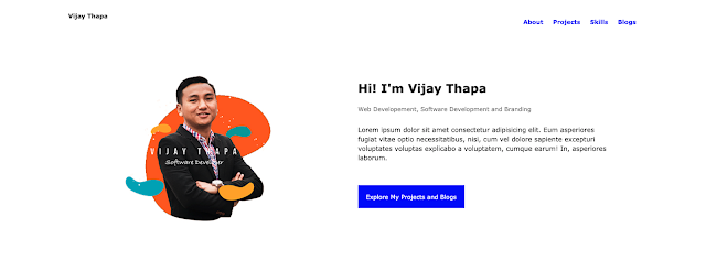
To design this section, I've followed Visual Hierarchy design principle.
If you just look at this section
a. First you'll look at the image with bright color and my face
b. Second you'll look at "Hi! I'm Vijay Thapa"
And these two sections helps you to get recognized or remembered among the probable recruiter or employer.
c. Then you'll look at the Bright Blue Button which forces the visitor (people checking website) to explore your website.
I see many portfolio website adding Download Resume Button or Social Media Links. And I don't like that approach because if the visitors go to your social media profiles, they may not come back to your website again. Due to which your projects, skills or blogs will never be seen by them.
And do you think the recruiter or employer will download the resume from the first section of your website?
d. Finally the visitor will also look at your about description and designation while looking at the main title "Hi! I'm Vijay Thapa" and the Button.
 |
| Portfolio Website - About Section |
2. Projects, Skills and Blogs Section
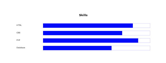
To design the "My Projects", "Skills" and "Blogs" section, I've followed White Space and Clean Design (also called Minimalist approach) Design Principle.
In these sections you can see I've not used much texts or any other elements. It's minimal and Clean, and doesn't distract visitors from the objectives (or purpose of the website).
Like the projects have image clean image in the background and text title above them. And the color contrast between background and the text makes it clearly visible to the visitors.
Also the visitors can click on the projects if they want to know more about the project.
Similarly, the skills section just has a Skill Title and skill meter filled with primary blue color.
And at the last, the blog section has clear image and text for the blog which is clickable to read the details.
3. Footer Section
Finally, the last footer section has a big bold "Download Resume" button on the left side.
And less number of buttons means less distraction and quick decision. Thus, if the employer/recruiter is impressed by the overall portfolio, they won't hesitate to download the resume for further communications.
Also they can contact on professional social media sites like Github, LinkedIn, Dev.to, Medium, etc. from the bottom right side of the footer.
Color Psychology
Every color has its own meaning and is one of the important factors in branding as it relates with persuasion.
For our "Portfolio Website" project as well, I've selected Blue as a primary color. Because the color Blue means Intelligence, Communication, Trust, Efficiency, Serenity, Calm, etc.
Which supports our objective of "gaining trust among the probable recruiter/employer".
Click to Read More about "Color Psychology"
Tutorial to Create this Website
Download Portfolio Website [button_primary]
Donate
PayPal[button_primary] Buy Me a Coffee ☕️[button_warning] Patreon[button_dark]


![Advertisement [ad]](https://blogger.googleusercontent.com/img/a/AVvXsEgVAiCox6-vLXsNZas8ks-nfos0PgdnL4yClmlqOkl92t7zGdYYiLBy9AHMZFxBYe06DVmN6JGQ9S0P3iClXk8l43FIQPDyAcx_uMmV0bN9JlKjTzOAi7YjmQo6cuvHgkEO76L-hcqV-TWE29v93eeFby8MOAOuJ8DcilHTPpfP8aKg8TG9uYCDaMxcr8H1=s600)

Comments